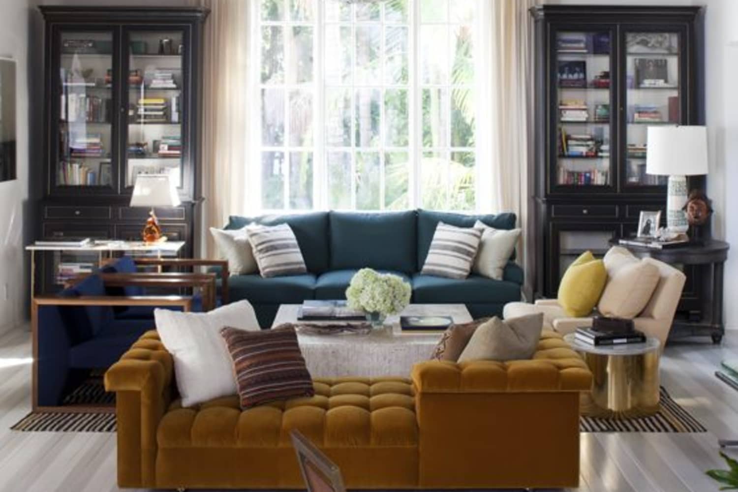
Design Lessons: How To Spot (& Fix!) an Off Balance Room

Balance is a tricky beast when it comes to interior design. Some people love perfectly symmetrical spaces, and others are utterly bored by them. Wherever you fall, you’ve got to admit that a balanced space — in terms of color, visual weight, pattern and layout — is perfectly pleasing to the eye. But knowing how to get there takes trial and error. For some examples, I’ve rounded up a few spaces that with a tweak or two, could be perfectly in balance.
Note: The lovely first image, via the inimitable Nate Berkus, is perfectly balanced. And you know what else? It’s hard finding photos of off-balanced spaces! There are a lot of carefully designed rooms out there on the internet. Some of the following might be only one view of an otherwise perfectly balanced space, so keep that in mind!
I love this living room from House & Home: it’s warm, colorful, and just looks inviting. If there’s one teeny issue I have, it’s with the arrangement: both the sofa and vintage card catalogue chest are heavy, rectangular shapes, and with them on the side of the fireplace, it seems a little lopsided.
Suggested tweak: If it were my home, I’d switch out the chest with the lighter console table, where the plant and art can balance the smaller shapes of the chairs and cushions on the opposite side of the room.
The furniture arrangement in this space from House & Home is spot-on. But the trouble with long rooms like this is that whatever is placed at the end — in this case, that sofa and chairs against those stunning windows — naturally has a bit more visual weight, and often renders whatever comes before it an afterthought.
Suggested tweak: So that lovely plum sofa and leopard ottoman don’t feel like they’re in a hallway, I’d consider adding area rugs to both seating spaces, which would give them the same visual importance.
Here’s another space (from Hus & Hem) I think a rug could help. Those two wood antiques are beautiful, but they’re rather lost opposite the visually heavier bed, especially in such a large and airy space.
Suggested tweak: I think a larger rug at the end of the bed would help this situation, as would a large mirror or piece of art over the chest of drawers.
There are already some nice elements of balance happening in this bright and sunny space: the arrangement of plants in the windows, as well as the two pairs of artwork. The only problem is that the sofa takes over, in terms of color and size, making the overall effect a bit lopsided.
Suggested tweak: Things that could help include a long, solid sideboard or media console on the opposite wall, holding the TV and record player, as well as a larger, centrally-located rug that would tie these items together.
Hopefully some of that was helpful! If you’re concerned about your layout being balanced, sometimes taking a photo can help. Have a critical look at the size, visual weight, color, and texture of your furniture and accessories — the trick is to keep the eye moving, so it doesn’t rest in one dominant area.
link

:max_bytes(150000):strip_icc()/GettyImages-960901964-28b936b326d042178eda1952857341b9.jpg)


:strip_icc()/102461138-af52f904eef7441fb68265bc6ddf674b.jpg)
:strip_icc()/091401781_preview-31b6263da01844dd9c8c0fa826ca959b.jpg)